In Part 1, Adventures with Power Apps: Fun with Canvas Components! (Part 1) – Matt Ruma, we looked at how to build a reusable Canvas Component.
In Part 2, Adventures with Power Apps: Fun with Canvas Components! (Part 2) – Matt Ruma, we made the Canvas Component more dynamic and reusable by other Canvas Apps.
In Part 3, we will look at creating a Component Library.
Using a Component Library that makes our Canvas Component even easier to share with other Canvas Apps and provides a mechanism for updating.
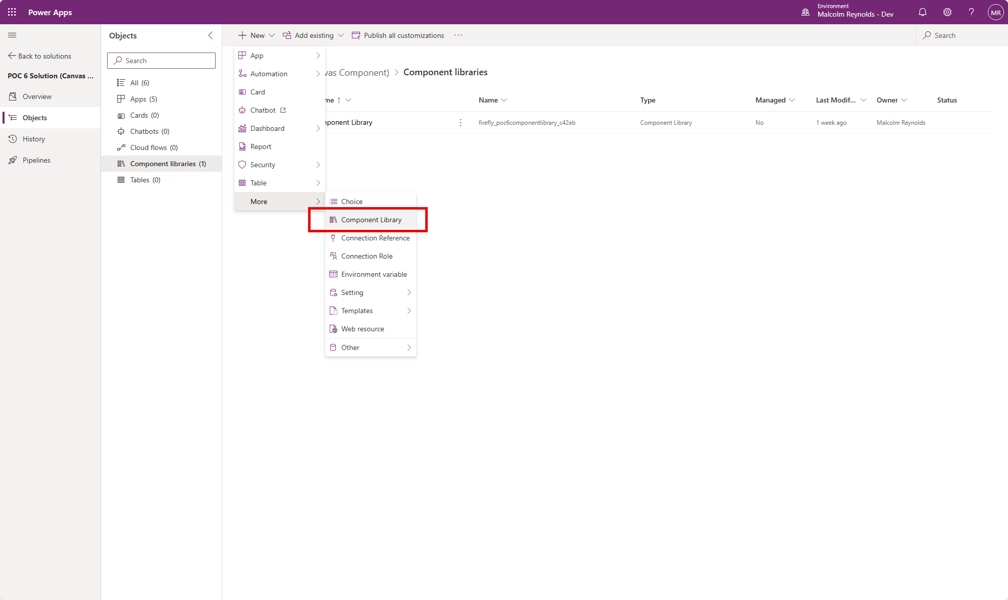
Let’s navigate back to the Solution.
To add a Component Library, I click New, then More and then Component Library.

The Component Library opens in Power Apps Studio.
In the Tree View, click Components and then click the Import icon.
Select the Canvas App where the Component exists that we want to make part of the Component Library, in my case, I selected the Canvas App called POC 6 Canvas App V4.

I updated the names of the Canvas Components used in the Component Library, but not necessary to do so, I could have imported the Canvas Component as is.

I clicked Save and then Publish.
Now my Component Library was ready to be used by my Canvas App.
Ideally, I would create the Component Library in its own Solution, and then import into the Environment as a Managed Solution.
In my Solution, I created a new Canvas App called POC 6 Canvas App V5.
From the Insert pane, I clicked the Get more components icon.
I selected Component1 from Import components in the POC 6 Component Library.

Similar to the other Canvas Apps I added three screens, Screen1, Screen2, and Screen3.
I set variables in the Formulas property of the Canvas App.
gblIconSize = 64;
gblIconSpacing = 20;
gblIconSelectedColor = RGBA(56, 96, 178, 1);
gblIcons = Table(
    {
        Value: 1,
        Icon: Icon.EmojiSmile,
        Screen: Screen1
    },
        {
        Value: 2,
        Icon: Icon.EmojiNeutral,
        Screen: Screen2
    },    {
        Value: 3,
        Icon: Icon.EmojiSad,
        Screen: Screen3
    }
);
I added the Component to each screen, which now shows up in the Library components section of the Insert pane and menu.

I update the properties on each Component.
Icons: gblIcons
Default: 1
Icon Size: gblIconSize
Icon Spacing: gblIconSpacing
Icon Color: gblIconSelectedColor
I tested the changes, and they worked great! 🥳
Now I have a Canvas Component that is truly reusable! 👏
To take this one step further, I would recommend putting the Component Library in its own Solution, and then Export that as a Managed Solution that can then be imported into other Environments and be consumed by other Canvas Apps.
You can download the unmanaged solution at https://mattruma.com/wp-content/uploads/2024/04/POC6SolutionCanvasComponent_1_0_0_0.zip.
Discover more from Matt Ruma
Subscribe to get the latest posts sent to your email.

